My husband, oldest daughter (the youngest wasn’t even cooking yet), and I purchased our current home about 2 year ago. We were, previously, in a 2 bedroom multi-level 1300 square foot condo, but we realized that it was time to move our family to a bigger home with more space once our daughter became more mobile. We put our condo on the market in March, received several offers 2 days after listing, and closed on the sale in June. Meanwhile, while “passively looking” (I call it “passive”, but I was basically ready to put an offer on anything that checked our must-have boxes), we fell in love with our current home, put in an offer, and closed at the end of July.
If you don’t know anything about me, please know that patience is not a virtue that I possess. Knowing that about myself, I vowed when we bought this house to take my time decorating it, and not to put anything new in our home that we didn’t absolutely love. I wanted to be very intentional with the way that I decorated. With that, we placed the old furniture that we kept where we could, and slowly but surely have been decorating the house room by room. The first room that I can consider complete is the one that I want to share with y’all today – our family room!
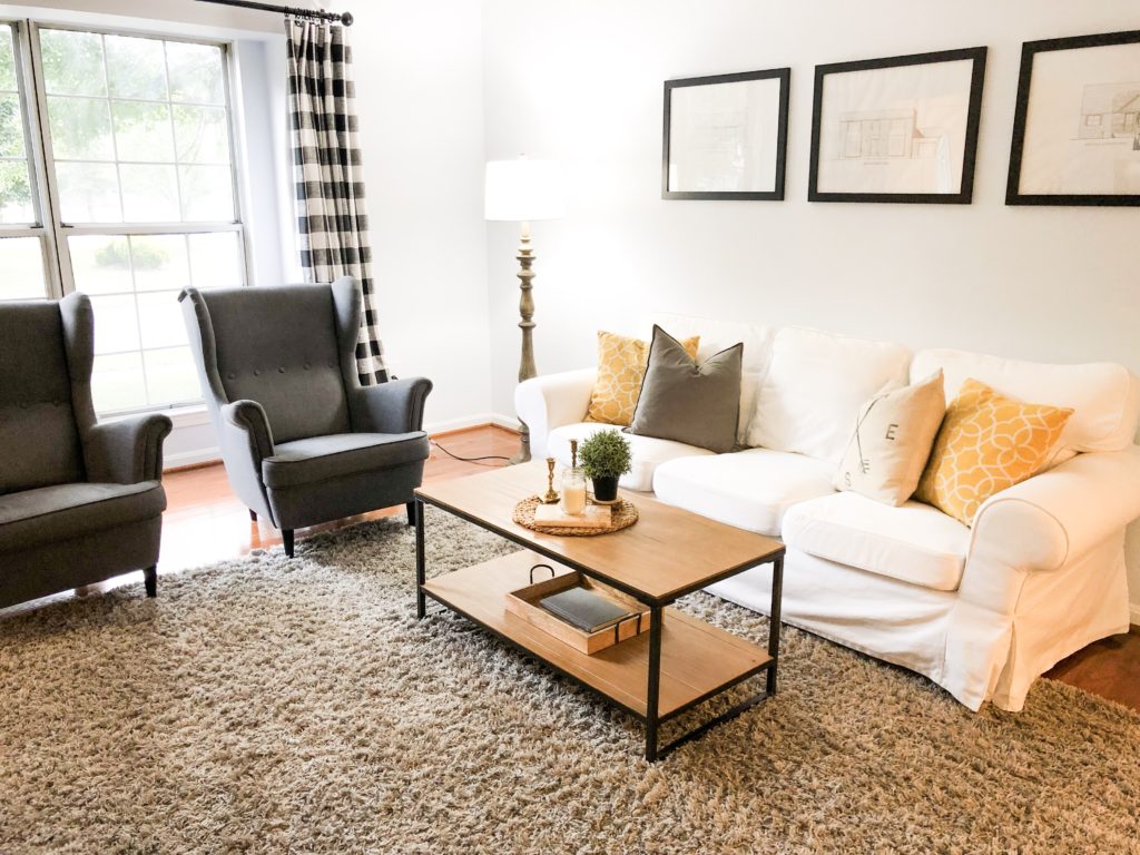
This is my absolute favorite room in our home. Every since the “farmhouse” craze hit the airwaves, I have been OBSESSED with white slipcover sofas. Like most farmhouse lovers on a budget, I opted for the Ikea EKTORP sofa in white, of course, to scratch my slipcover sofa itch without spending our life fortune. I can write a whole post on my thoughts and review of the white EKTORP if y’all are interested – let me know in the comments! The throw pillows on the couch, I used Ikea pillow inserts (perfectly choppable cushions) with a mix of Ikea pillow covers and covers from Amazon.
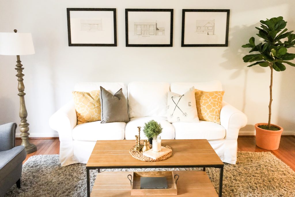
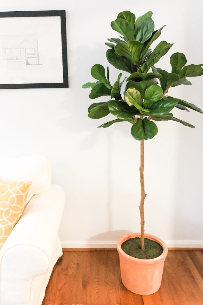
On the wall above the couch are very sentimental pieces for my husband and I. I have always been very intentional about what I put on the walls of my living spaces, to the point where it took YEARS to fill the walls of my old house. I knew I wanted something there on the wall, and the concept randomly came to me. I shared it with my husband, and we both had the “that’s it!” feeling. They are pencil sketches of the house that my husband grew up in, the house that I grew up in, and our current house (the first home that we purchased together and the one that our children will likely grow up in), done by a local artist using photos and google-maps images. Neither of our parents still live in the houses that we grew up in, and my husband’s parents’ house was actually torn down and turned into a pharmacy. These sketches are so nostalgic, I still look at them 2 years later and smile.
I had a very specific style of coffee table in mind for this space. I wanted something that would bring in the clean lines, metal, and wood elements. I was also very particular about the size of the table. The table couldn’t be too small for the sofa, and also could not be so large that it took up too much floor space. To my surprise a couple of months ago, this table popped up on a Facebook marketplace group. It was 10 minutes from my house, perfect size, and perfectly priced. Of course, I HAD to snag it.
I also turned to Ikea for our armchairs with the STRANDMON in Nordvalla Dark Grey. They were the perfect dark grey color and gave me a classic vibe with a modern twist. As a bonus, the EKTORP has a cover option in the exact same material and color, so I figured I could swap out the white slipcover for the grey one that matches the armchairs if I ever got tired of the upkeep.
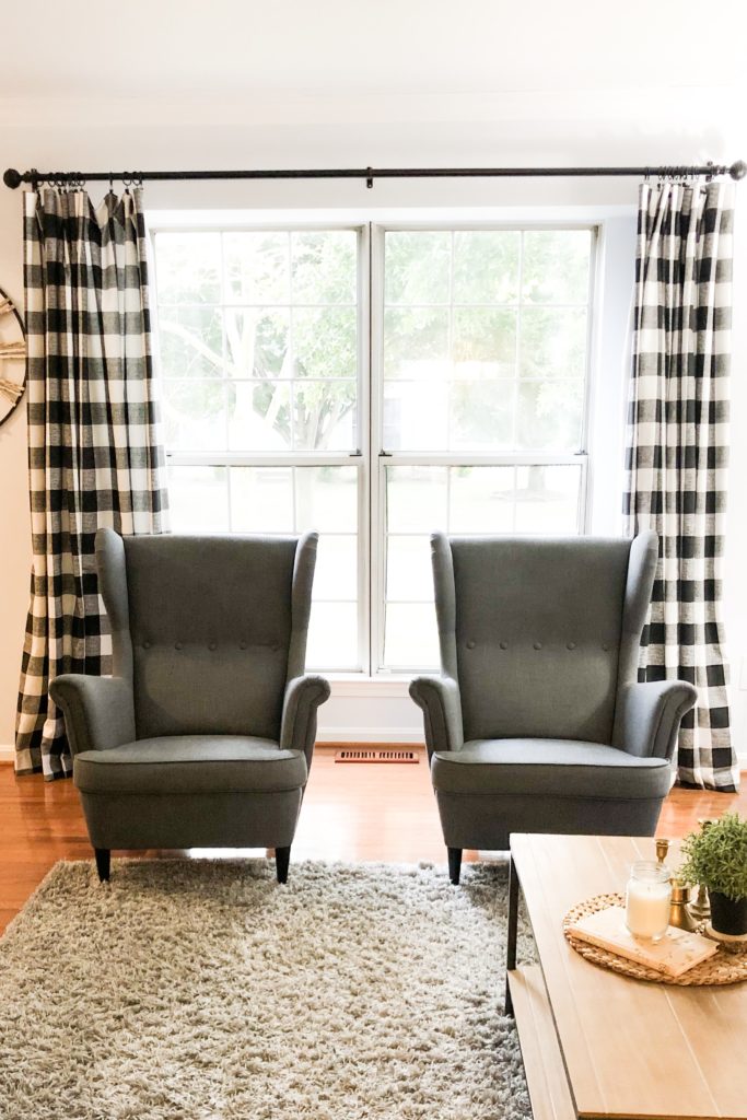
The curtains are one of my favorite home purchases to date. I had it stuck in my mind that I reeeally wanted to break up the monochromatic gray that I had going on with some bold drapes. I love gray, but geeze! I saw the buffalo check pattern and could not get it out of my mind. I HAD to have that pattern on my curtains! If you’ve ever researched buffalo check curtains, you know that they are wildly expensive. I found a seller on Etsy who handmade curtains in the exact look that I wanted… SCORE! Except they, too, was out of budget. I had a chat with the seller, and she let me know that she had a less expensive fabric that was still great weight and quality for drapes, but were cheaper because the buffalo check was printed on the fabric instead of actual multi-colored thread being weaved together to make the pattern (if that makes sense). I was sold! I could not have dreamed of more perfect curtains to really add some interest and uniqueness to this room. Unfortunately, the seller is no longer on Etsy.
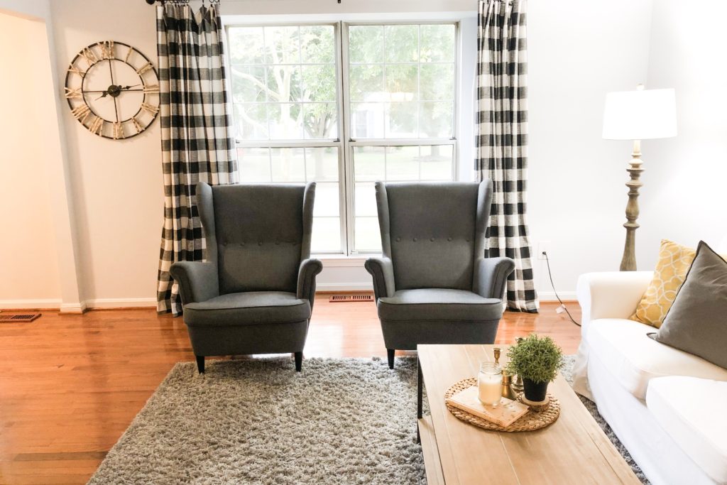
There is no ceiling lighting in the family room (something that we hope to fix in the near future), which caused a need for a functional floor lamp. I really wanted a wood-look floor lamp that I saw all over the internet, which was from Target. Unfortunately, that lamp was discontinued, but I found this similar one at Walmart. I did change out the shade for this one with the cleaner lines – the one that came on the lamp was more traditional in style. With the new shade, this lamp is exactly the look I was going for.
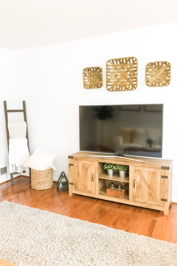
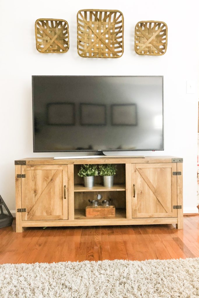
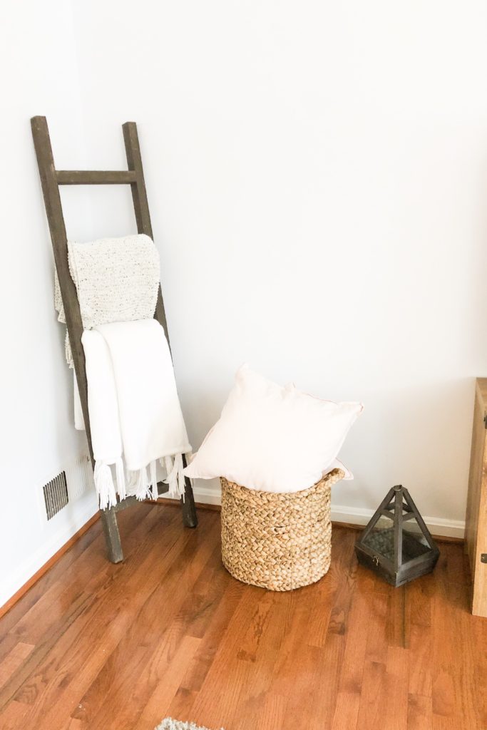
My TV stand is from Wayfair, and was one of the first purchases I made for the room. The actual one I have is no longer listed, but this one is identical, and the color equivalent for mine is “rustic oak”. The rug, also one of the first purchases, is from Amazon and the price was an absolute steal. The blanket ladder is also from Amazon for a great price (those things are quite pricey as well). Above the TV are baskets that I found at A.C. Moore. I knew I wanted baskets for this wall, and I ran into these on sale. To be honest, I am still debating on whether to keep these or replace them with round flatter tray-like baskets. What do you think, keep or ditch them?
The last piece that I added to this room was the fiddle leaf fig tree in the corner. Actually, I added a live one several months ago, and it died almost instantly. I finally replaced it with one that I couldn’t kill (aka fake… faux if you want to be fancy). I always have to add greenery to any space that I decorate. It brings in an element that makes me feel more grounded and calm, and it adds texture and visual interest to the space. The plant is from the Heart & Hand by Magnolia line from Target that I have been eyeing forever. The terracotta pot just adds a pop of color while keeping things pretty neutral.
And there you have it! Two years later, our family room is finally complete. This room is our family’s favorite place to hang, and it makes our guests feel at home, which is important since it’s the first room you see when walking into our home. What is your favorite room in your home and why?

